Thursday, April 27, 2006
Tzivia, I really think youre right about a flash drive thief. Mine also went missing right after finnels class. Any idea where they might be hanging out? Maybe they're all growing legs and running away! If anyone elses goes missing we're going to have to rename this blog "The Lost Flash Drive Support Group"
Wednesday, April 26, 2006
mosaic work in progress...
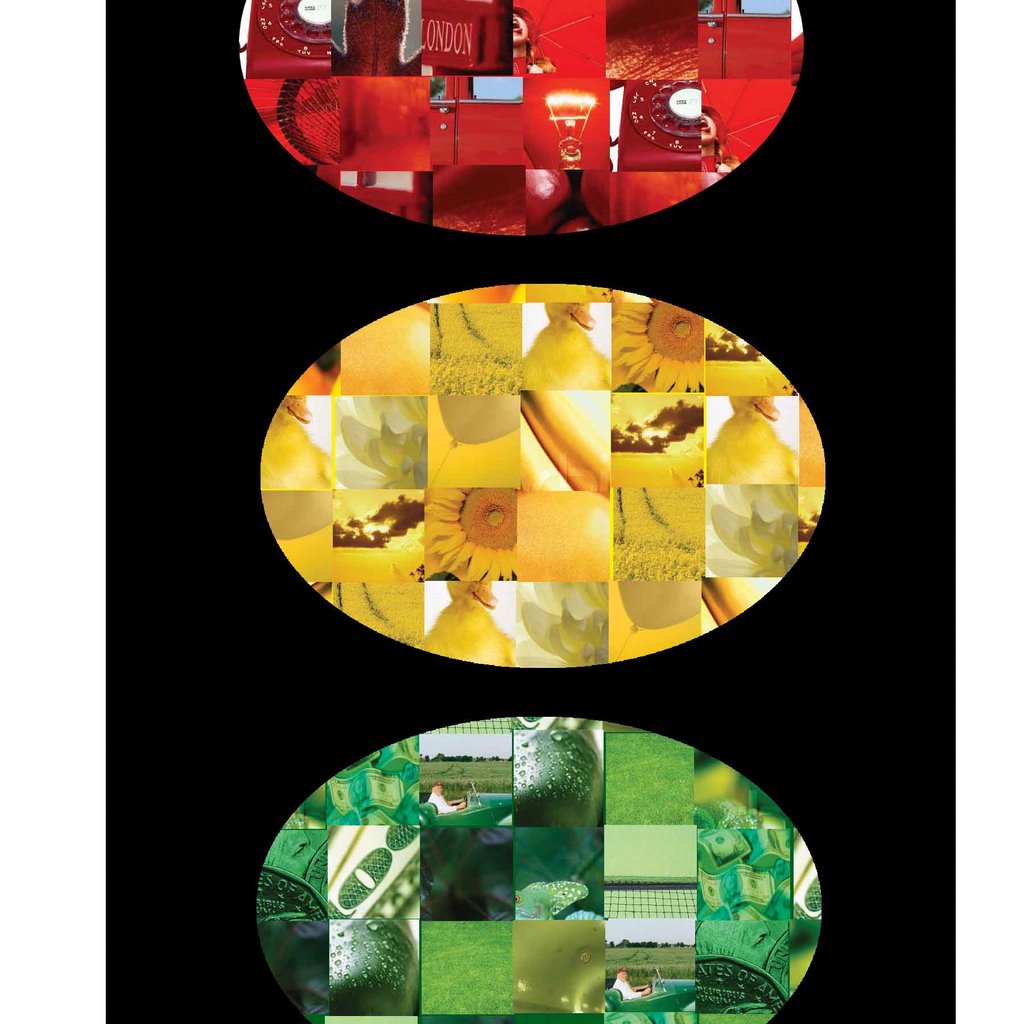
emj this is for u - its a work in progress but its kinda going somewhere (its gonna be a traffic light if u couldn't tell)
so i did the action automate thing for the cropping then to make the pics in circles i played around with layer, clipping mask and merged a circle with the pics (it took a lot of trial and error til it actualy worked...)
why am i up at 2am??? i seriously need to learn better working habits!
Saturday, April 22, 2006
HELP PLEASE
Ok, everyone, here's the sad reality...vacation is OVER!
So, I thought I'd be all responsible and everything, and get started on my photo mosaic, when I realized that I do not have a CLUE how to go about doing it.
So this is my cry for help....anyone?
So, I thought I'd be all responsible and everything, and get started on my photo mosaic, when I realized that I do not have a CLUE how to go about doing it.
So this is my cry for help....anyone?
Sunday, April 09, 2006
What kind of cookie are YOU?
This was my results:
Everyone post what you are :-)
| You Are a Chocolate Chip Cookie |
 Traditional and conservative, most people find you comforting. You're friendly and easy to get to know. This makes you very popular - without even trying! |
Everyone post what you are :-)
Friday, April 07, 2006
WE'RE FREE!!!!!!!!!!!!!!!!!!!!!!!!!!!!!!

goodbye touro hello pesach =)
(ok so maybe we have some hw due... but we can ignore them for now)
Wednesday, April 05, 2006
Speaker
What did everyone think of the speaker last night? I thought he was really good...it was definitely better than class, that's for sure! I wish we had a teacher like him!
Saturday, April 01, 2006
Notes for Finnels midterm
Ok i decided i'll be nice and put my notes on here. :) I hope they're clear... these notes were taken in class in between IM'ing and checking my e-mail and onlysimchas so they might not always make sense...
If you have any questions just ask!
If you have any questions just ask!
- In the word Typeh the height from the top of the T to the bottom is called the cap height. The part of the "y" that comes down from the line is called the descender and the part of the "h" that extends up is called the ascender.
- The height of a letter with no ascender or descender is called x-height/ Examples: e, o , n, etc.
- Cap height usually varies in comparison with the point size of the font. Usually it is 66-72% of the pt. size.
- Leading is measured baseline to baseline.
- Don't use auto-leding! - It's 120% of the type face
- DO use curly quotes. Not ". (those are inch marks) You can change to curly quotes in Quark-->preferences-->interactive-->turn on smart quotes.
- Hard Return= pressing enter
- Soft Return= pressing Shift+Enter- this does not apply any paragraph settings such as indents etc. that you set.
- Kerning- Quark: Ctrl+Alt+Shift (to make more or less)
- Kerning: Illustrator: (can control amount of increase at a time in preferences) Alt + right/left arrows
- Dont condense type manually. Only condense if the typeface itself is condensed. You can use it sometimes for effect, but not too often.
- When have reverse type, = dark box with a light color type, use a bold weight type and add some tracking to make it easier to read.
- Legiblity: how easy it is for readers eye to follow the page as a whole.
- If you have longer lines, should use more leading.
- If Quark is set to curly quotes, and you want to switch back to " for something, press CTRL+ALT+ "
- M-Dash: a long dash-- (pretend that was one long dash!) M space dash is the size of the type point size. It will vary in different fonts so using the standard M space (You can check off "standard M space" in prefrences by Quark) will make that space the same size no matter what the font. **I'm not sure if he said we should or should not use the standard M space so if anyone knows please post!**
- There are 6 picas per inch, 12 points per pica, 72 points per inch.
- For a page not to be too crowded, the page should be half dark, half light. Multiply the the height of the page by .7, then the width by .7.- that is the size of the part which should be dark/light. Ex: page is 5 x 7. Multiply 5 by .7= 3.5. Multiply 7 by .7=4.9 Size= 3.5 x 4.9. (huh?? i dont really get that lol )
- To know abot how wide your columns should be, type the lwer case aplhabet and measure in picas. Then multiply that by 1.5 . and that should be the width.
- **The EYE is always the best tool instead of mathematical formulas. (so why bother telling us them in the first place?!)
- In InDesign can do alot of type features. Type-->make optically nice. or something like that.
- Quark: Edit-->new H & J - can change word spacing , etc
- Quark: easy way to get type going around a shape- Ex: to get type around a circle, make a circle text box, type something, then click shape-->change to line, and the type wll automatically go around the shape.
- Spread: 2 facingpages in a book. 2 types:
- Advertising Spread = ad
- Editorail Spread = has type, it's an article, etc
- Trim: actual size of the paper / ad
- Safety/Live: the area that the important elements of the page should be in. Ex: type, logos
- Bleed: if you want the image to go till the end of the page you have to extend the picture beyond the trim size in the program you are working in.
- Hierarchy: page should have a structure- path for the eye to follow. Most importnat things should b big, etc
- Proximity: how close different elements are to each othr. Elements that are near each other should relate to one another.
- Pull Quote: gets readers attention to the article- it is a quote from the article that is put in the page in big type to get the reader to read it .
- Drop Cap: says read here first, makes it visually interesting
- Side Bar: elaborates on something in the text- explains how to do something, can be a chart, statistics, etc
- Quark: to save linked pictures, go to File-->collect for output
- Quark: to check if picturesare linked go to Utilities-->usage-->press update to link them. Should show the pictures there.
- When preparing for print, your images at 100% should be twice the line per inch size of the publicaion. Ex: newspaper- lines per inch/line screen is 65. So the dpi of the image at 100%should be 130. If you scaled the image down to 50% you only need half of that dpi. (65)
- To get the symbol of three dots instead of just typing ... click ALT + ;
- alignment, repetition, contrast= all these elements make things POP!
- Symmetrical: everything is balanced
- Assymetrical: not balanced- in general design is asymmetrical- cuz it pops more.
- Poster: should have a few good elements that stand out. Type can go on differnet angles, etc.
Kay thats all i have! Feel free to add anything!
oh also there was one thing that i didnt really understand dos anyone know what this means- something about CTRL SHIFT N makes a rule above make rule fat- use minus value on offset
anyone have an idea what that is ?
Thanks have fun studying!!
Subscribe to:
Comments (Atom)